The Miory tourist brand developers came across an idea, thus creating a sustainable association, both understandable for local residents and attractive to tourists, since the brand should cause interest to traveling in Miory District among Belarusian tourists; at the same time, it should engage local residents in the local development of the district; it should also instigate small-scale entrepreneurship.
The preliminary locality surveys have helped to identify the unique attributes used in the brand foundation.

It gave start to the core of the brand, the basis for its positioning and slogan.
Natalia Sarakavik, APB Tourism Development Specialist:
- We are very happy to be part of such an important and interesting process, as the Miory District brand development. The fascinating nature of the area is inspiring; therefore, it has been a great pleasure to work on the brand book. In cooperation with a creative agency and local residents, we have developed a sizeable concept and strategy that will help the district to demonstrate its strengths to tourists.
The brand essence: Miory District – local exotics.
Positioning: Miory District – a place, where one easily can learn about a new ecosystem – high moors; one can be amazed by their beauty, and their difference from other sceneries, dismantling one’s preconceptions about marshlands.

Slogan:
MIORY LAND. SURPRISE IS NEAR (in Belarusian and Russian )
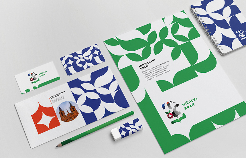
The project design is based on a well-developed positioning system. Dynamic identity was the best solution, since the district carries several symbolic attributes. It means that the brand visual elements may be used as a set for building a vivid and explicit image of individual areas and attributes of the district: the town of Miory, the village of Liavonpaĺ, Jielnia National Reserve, and the Miory Cranes and Cranberries Festival.
The main images issued in the logo and land identity design are the grey crane, for which Jielnia Reserve is a must-have stop during its migration, the wild cranberry, as marshland symbol; architectural symbols of the local historical monuments, as well as the lake area depiction in relevant icons.
Miory District is a place for learning about an ecosystem one has not known before. High moors are great natural places for recreation, while providing homes to dozens of plant and animal species, an important stopover for migrant birds during their challenging travel.
- Each district, town, or even a village means more than just the number of their residents, location and borders, - emphasizes Vitalina Dubitskaya, the brand strategy and positioning developer. – It carries its own spirit, traditions and culture that have been developed by generations. It has its streets and history that are known to visitors, as well as its secret places and legends that are known to the locals only; the nature that we see in the photos is even more striking in reality. And finally, the people that live there.
In the tourist brand development, it was crucial to see, how the design would work in the urban environment, supplementing street furniture both functionally and aesthetically, thus creating a wholesome image of the tourist brand right on the spot.
In addition to the urban design with direct practical purposes, such as public transportation stops, street benches, bike parking areas and streetlamps, they have designed the entry sign and an interactive art installation in the town.
In the development process, the professional team collaborated with focus groups, local authorities and activists. The brand book has been posted on the project website for public discussion, and its final version has been approved.
The Miory District brand code was developed by Moloko Creative Agency team:
Creative Director – Denis Misyulia
Strategy and Positioning Development – Vitalina Dubitskaya
Design – Kristina Mokhor, Alexander Kazyukevich, Liana Ryzhova
Street Furniture Design – Anna Nikolayeva, Anna Filatova
Management – Xenia Zheltko,
The brand book development process was led by Natalia Sarakavik, APB Tourism Specialist.
You are welcome to attend the Miory Cranes and Cranberries Festival on 19 September to appreciate the largest cranberries, the largest flocks of cranes, as well as the first district brand in Belarus
Media contact person: Natalia Sarakavik, APB Tourism Development Specialist.
sarakavik@ptushki.org


